Exploring Asia since 2003
Search
Regions
China
Beijing
Political capital of China
Guangzhou
The capital and the largest city of Guangdong province in southern China
Hong Kong
Former British colony (China SAR)
Macau
Former Portuguese colony (China SAR)
Shanghai
Business capital of China
Shenzhen
Special Economic Zone (China SEZ)
Taiwan
Republic of China (ROC)
Japan
Tokyo
Eastern capital of Japan
Kyoto
Imperial capital of Japan
Kamakura
The capital of Japan from 1185 to 1333 as the seat of the Kamakura Shogunate
Shikoku Pilgrimage
A journal of my 1,400km pilgrimage on foot around the 88 temples associated with the Buddhist monk Kūkai (Kōbō Daishi) on the island of Shikoku, Japan. April 30 to June 20, 2016.
Shōdoshima Pilgrimage
“Island of Small Beans” located in the Seto Inland Sea of Japan
Kumano Kodō
Ise-ji
Kohechi
Omine-okugake
Kamikōchi
Korea
Seoul
South Korea’s capital
Busan
South Korea’s second largest metropolis
Singapore
Republic of Singapore
Thailand
Kingdom of Thailand
Cambodia
Kingdom of Cambodia
Vietnam
Socialist Republic of Vietnam
New Zealand
Europe
France
Italy
Switzerland
UK
Her Majesties green and pleasant land
USA
“In God we trust”
About
Archives
Contact
Milestones
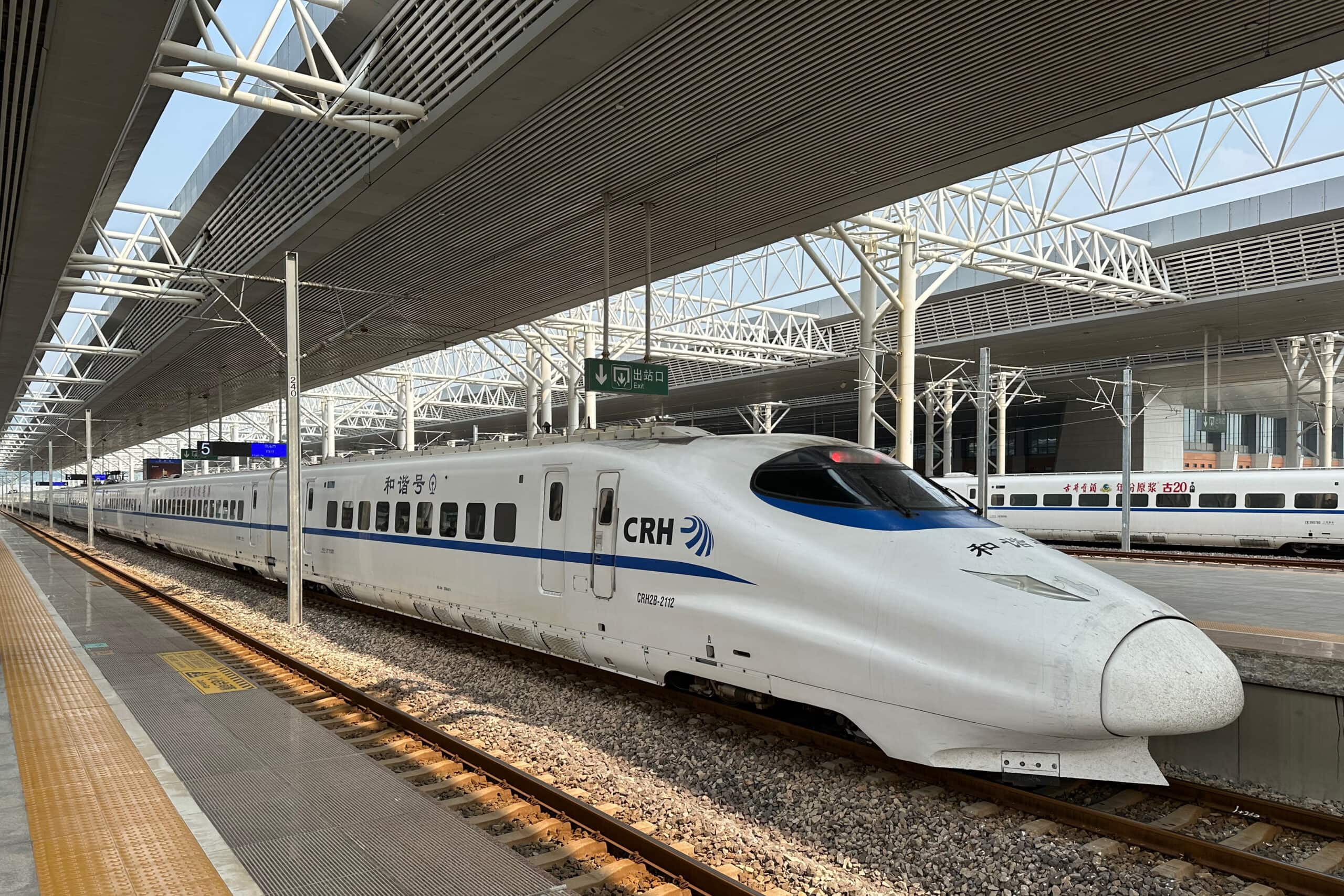
2024.05.07
China by High-Speed Rail
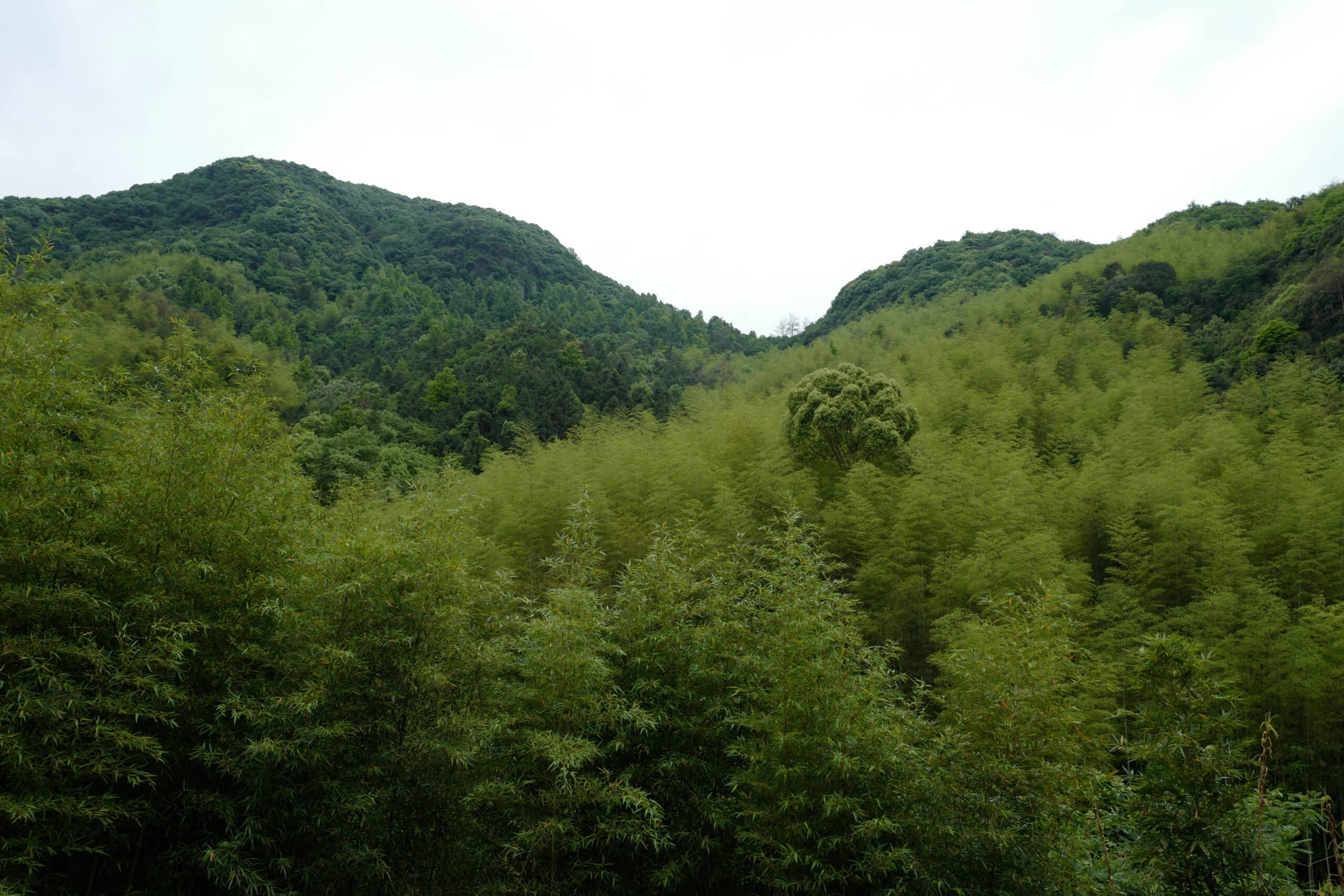
2024.02.14
Maling Ancient Road
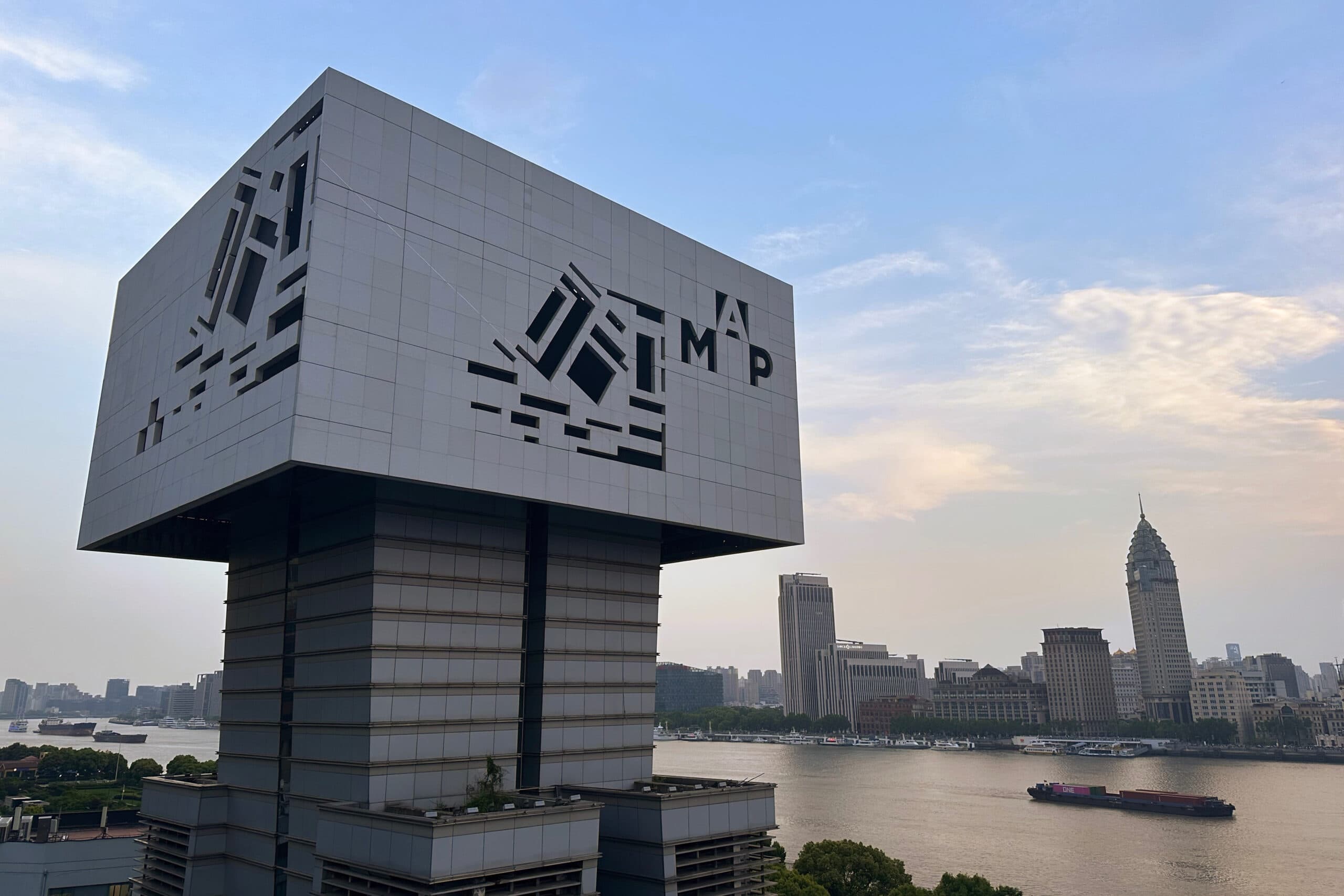
2024.02.14
Museum of Art Pudong
2023.12.31
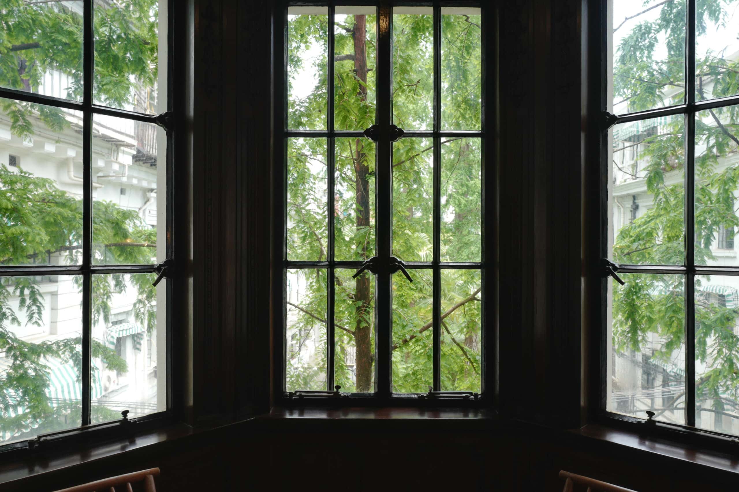
Rong Zhai Villa
2023.12.04
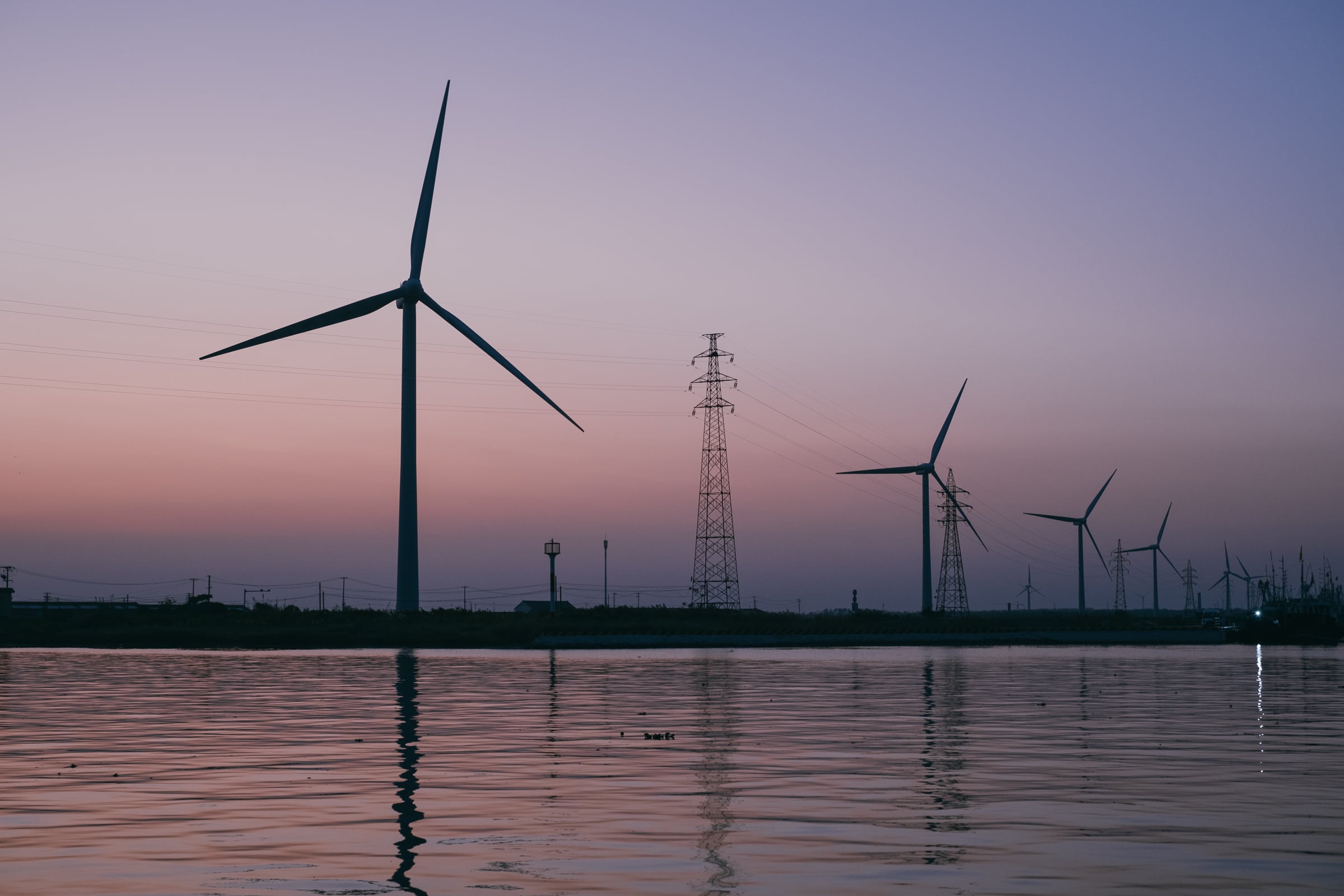
Rudong Wind Farm & Harbour
2023.12.04
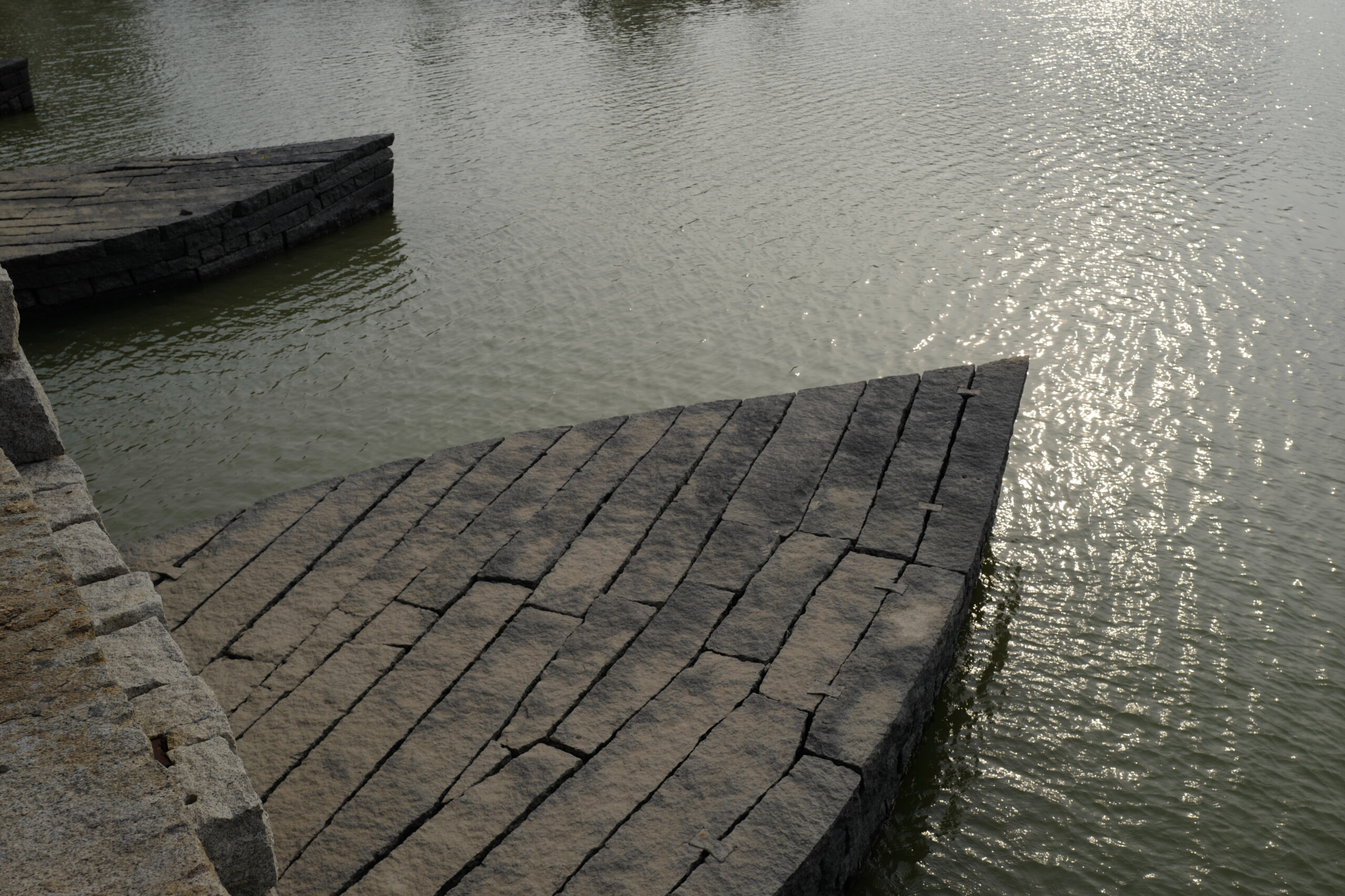
Luoyang Bridge
2023.10.29
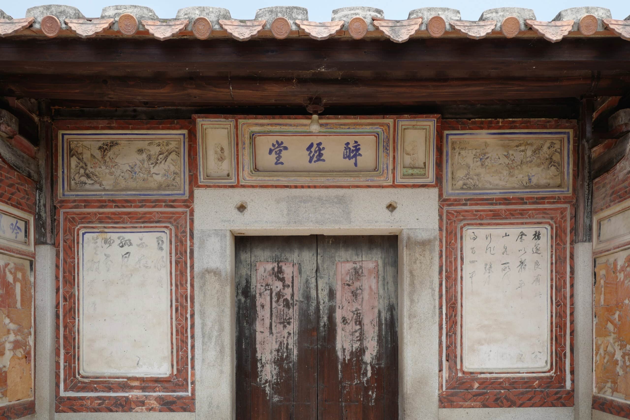
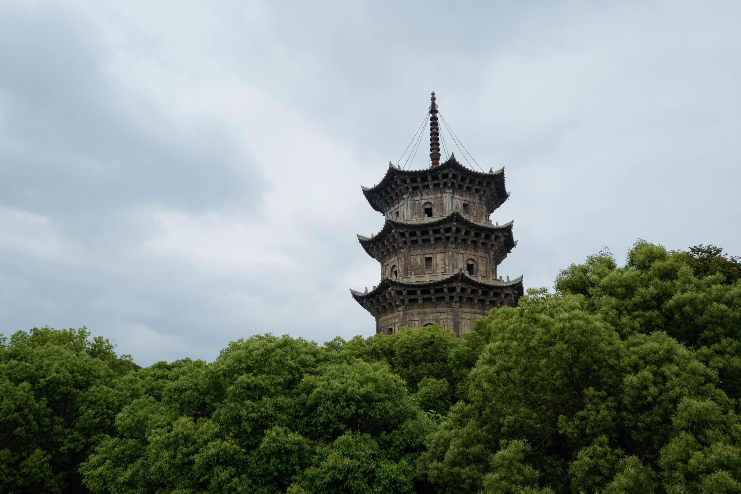
Quanzhou’s Ancient Dwellings
2023.09.16
Oyster Shell Houses in Xunpu Village
2023.09.03
Exploring Quanzhou
2023.08.31
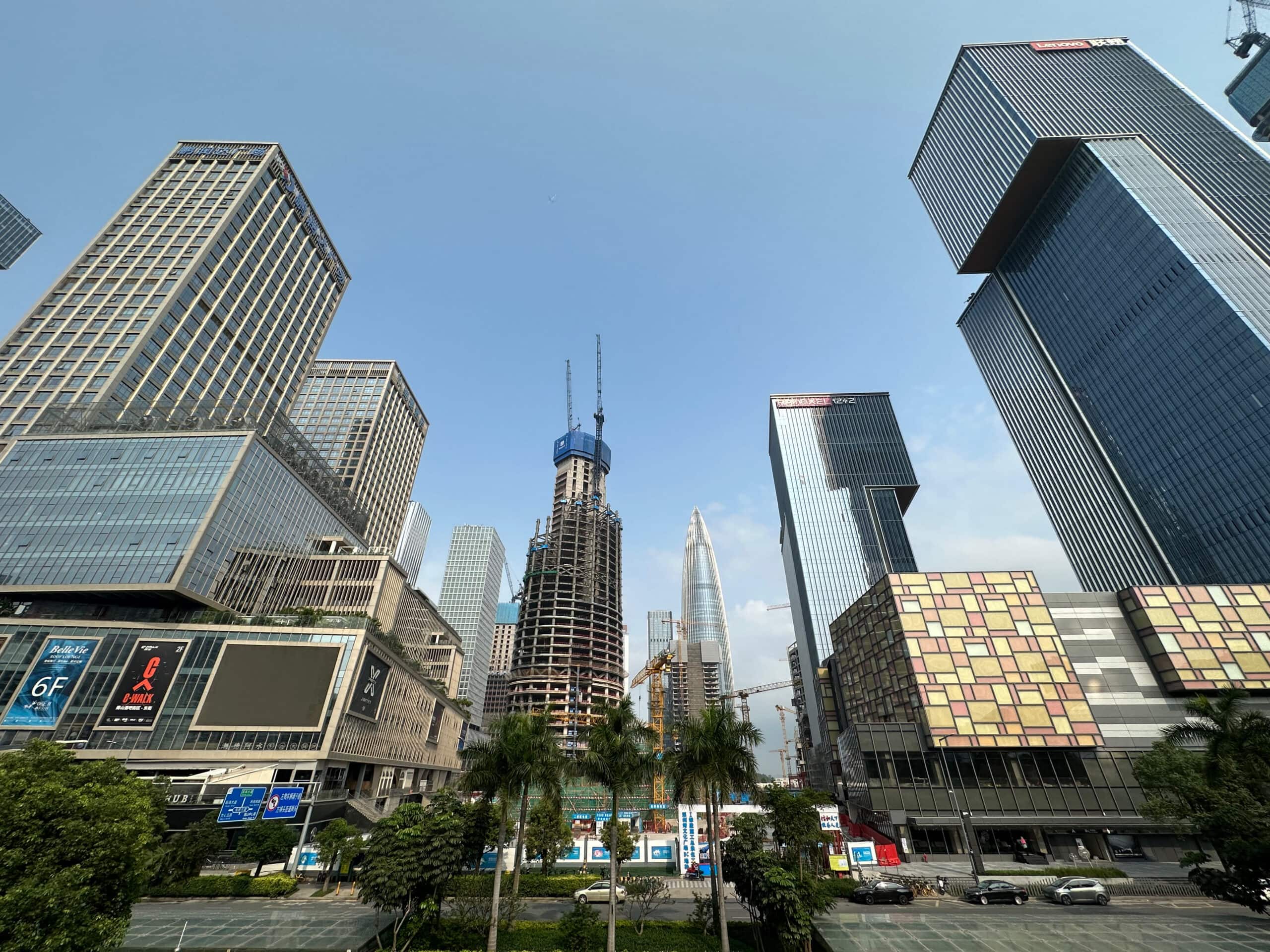
Return to Shenzhen
2023.07.23
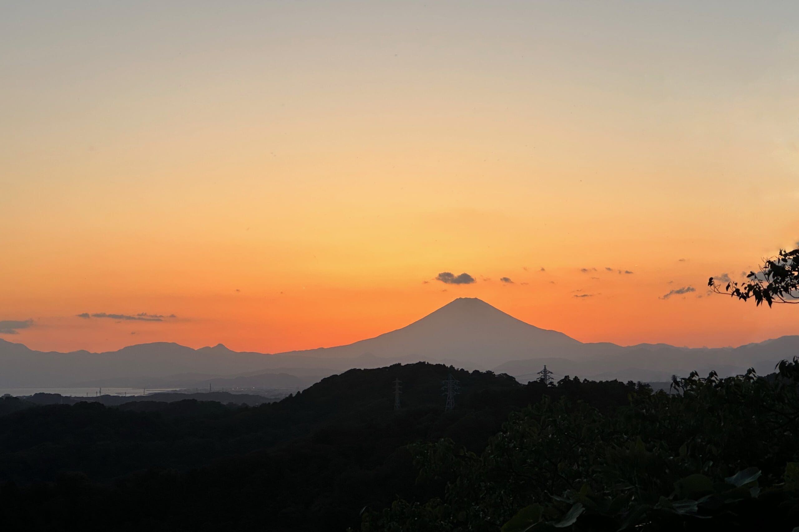
When the Sky Blooms with Sakura
2023.07.23
Next
→